Inspiration is important on the job, especially if you hold a creative position such as a writer or designer, or the immediate environment must put your clientele at ease, such as with counselors. Whether you’re working from home in an office right off the kitchen or you commute back and forth to an actual office each day, being your most productive self is priority #1.
Not only can you do more and better work, you can keep your energy up and put forth a positive vibe. While you may not think much about the walls of your office, it’s true that the interior paint colors you surround yourself with can either inspire productivity or hinder it. The last thing you want to do when trying to get your job done is to drain your energy – even if you don’t realize what’s happening.
It’s interesting to note that different colors have different impacts on the brain, and certain colors can actually make you more creative than others and boost your mood.
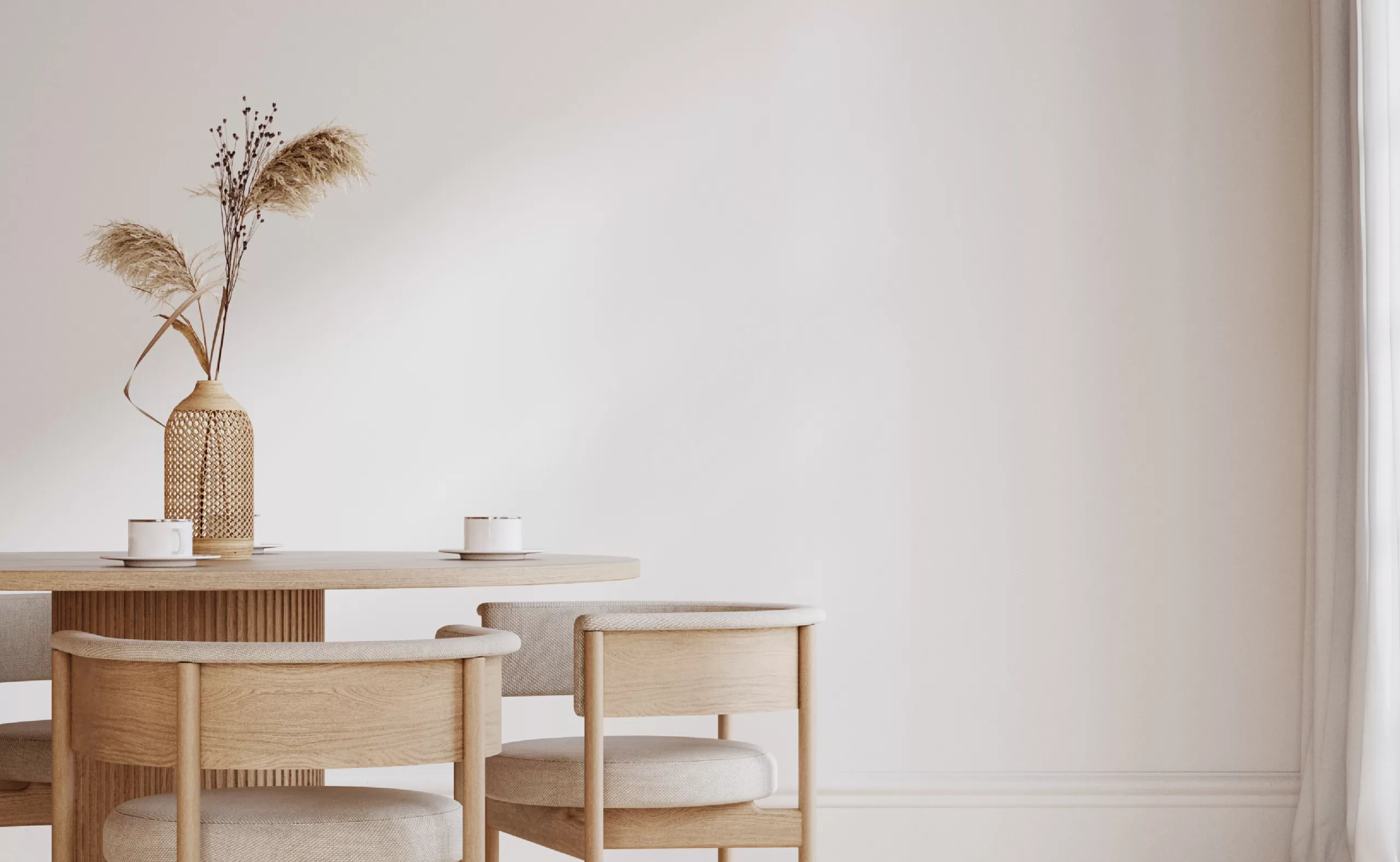
In general, bright, warm colors such as yellows, reds, and oranges will stimulate energy and happiness while subdued, cool colors such as greens, blues, and purples, tend to be more calming and soothing, says Mental Health America. The best uses for bright, warm colors are in rooms for entertaining such as kitchens or dining rooms, while cool colors are best utilized in relaxing spaces such as bedrooms, dens, and bathrooms.
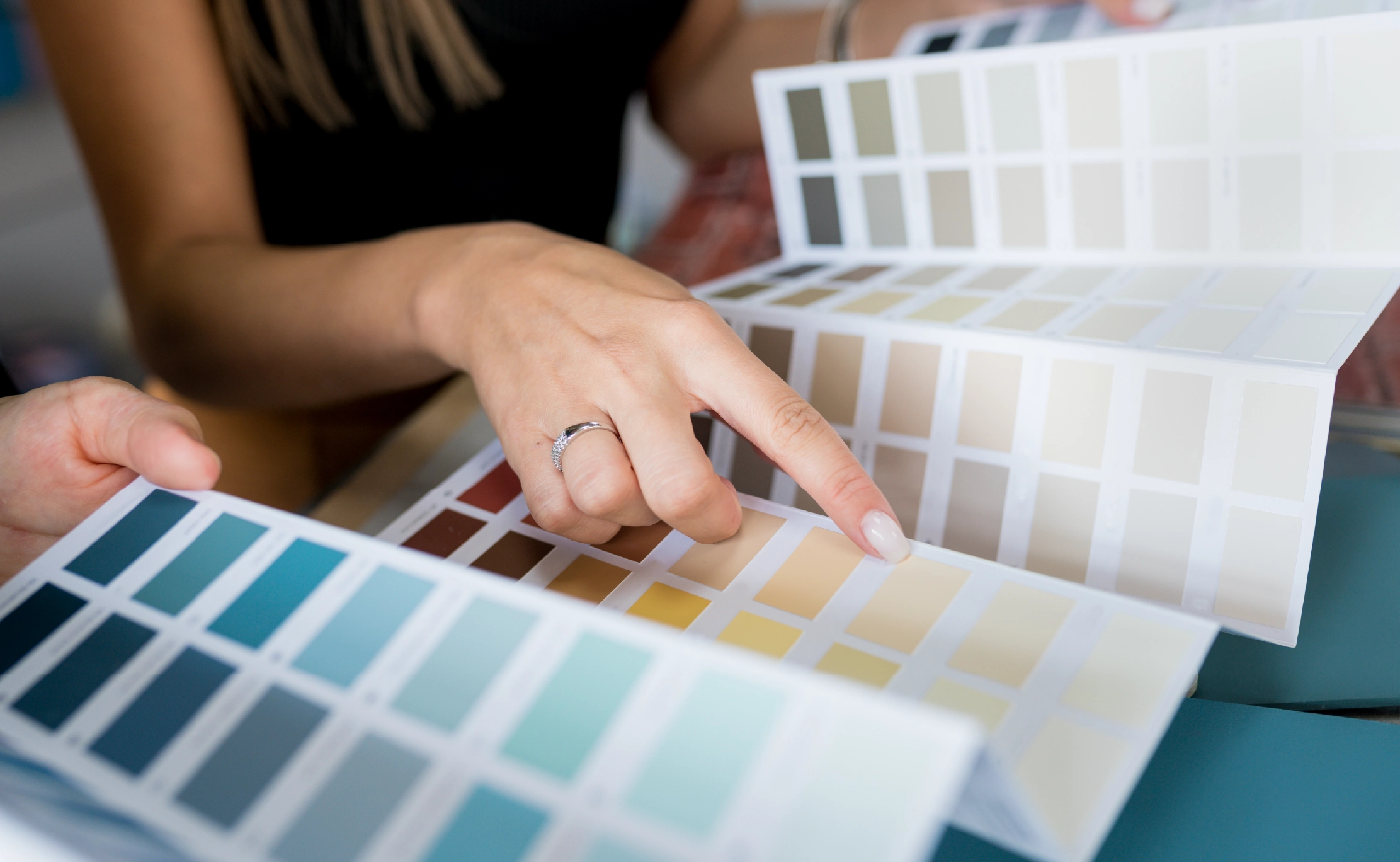
So if you’ve been thinking about switching up the colors in your office, here are some tips on choosing the right ones.
Warm Colors That Inspire Productivity In Energetic Workspaces
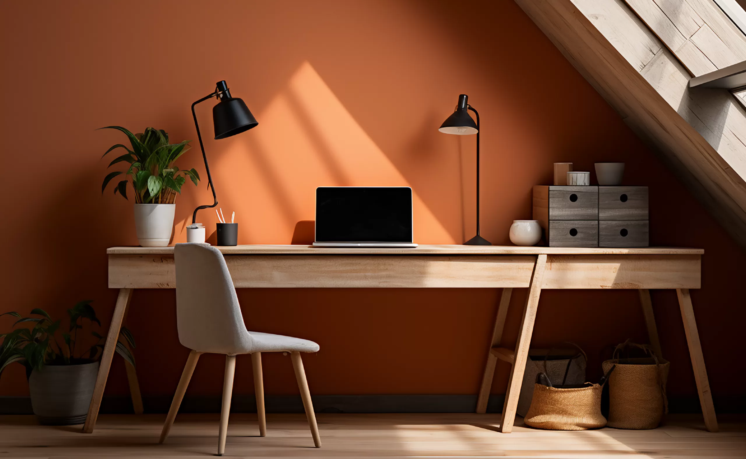
Bright, bold colors (think: red and orange) are classified as energetic colors that will help you if you work in a fast-paced environment. These colors trend to fuel high-energy folks who may work in a busy office, the trading room floor, or a funky retail space. However, if you work in a standard office or a home office, these colors may sap you of strength and stress you out.
You probably don’t want to use these colors if your home office doubles as one of your living spaces such as a dining room or bedroom. For these areas, try calming, low-energy colors (think: blues and greens).
Cool Colors That Inspire Productivity In Calm Workspaces
Light greens and blues are neutral and complement most decors. If you’re going for a productive yet calm workspace, try an earthy, muted green. If you want a bit more pizzazz, go darker with a rich cobalt blue. Just keep in mind that darker blues are more stimulating than lighter blues, which is great if you work in a repetitive industry where you need to maintain a high level of consistent output.
Those who thrive on peace and quiet in which to work, such as writers, therapists, and graphic designers, should stay within the beige and cream family. These pleasing tones are not distracting yet provide a pleasant, soothing environment that keeps you grounded and engaged.
Takeaways
Here are some quick takeaways on colors:
- Red creates a sense of urgency, which is why you see it used for emergency services such as fire trucks. Companies such as construction or engineering firms would do well with stimulating red walls.
- Yellow is an emotional color, so use it if you’re in a creative industry. This happy color boosts spirits, which is why you often see it used in the offices of counselors, therapists, and pediatricians.
- Green offers feelings of calmness and reassurance. Use it if you have to deal with extreme ups and downs throughout your workday, such as in the financial industry.
Paint Colors to Avoid
Now that you have a good feel for which colors to use in boosting productivity in your office, check out the ones you should avoid.
- White: Many people choose white because they assume it looks more professional and tidy, but too much of this starkness can actually be detrimental to not only the office design but employee morale as well. The last thing you want, unless you work in a laboratory, is to portray the office as sterile and boring. Employees may experience a creative block when surrounded by white, feeling drained of energy and inspiration. If you like the energy of white and the fact that you have complete freedom with furnishing and décor choices, you may want to go with an off-white, which is less clinical. This softened version is warmer than stark white.
- Red: Some hints of red here and there in your office can motivate employees and stimulate energy, but overwhelming amounts of red paint can lead to over-stimulation and agitation. Use this color sparingly and never as a predominant color in your office.
- Yellow: Yes, yellow makes people happy while introducing a jolt of energy. However, too much yellow can actually cause stress and anxiety, and has been proven to raise tempers in the workplace, says Very Well Mind. People even tend to cry more in yellow rooms.
- Gray: By its very nature, this is a very moody color, and tends to be depressing and suppressive. While incorporating varying shades of gray in your office can look professional and organized, using too much of one gray shade can lead to a sterile and unmotivating workplace.
- Lime: Accents of bright green can inspire creativity, but too much of it can sap the ability to concentrate.
In the end, the color you choose to adorn your office walls with is completely personal. Whatever makes you feel comfortable, at ease, and productive is what you should choose.
Get an Office Painting Quote From Fresh Start
When on the hunt for a reputable office painter in San Francisco, look no further than the experts at Fresh Start Painting SF in Daly City CA. Contact us today at (415) 347-7689 for your free quote and to schedule a consultation.